Depositories

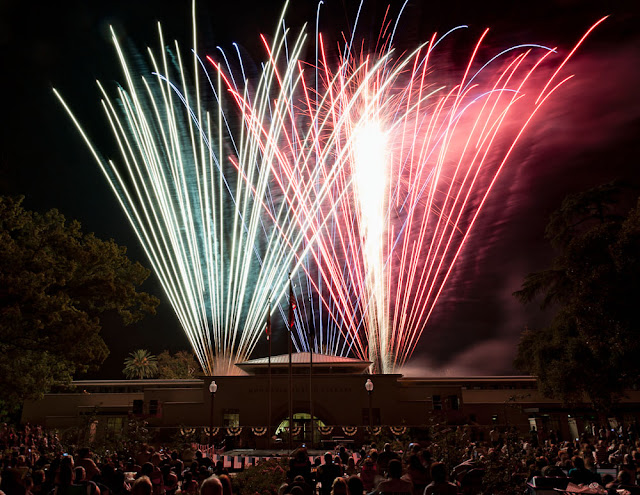
I may have posted a version of this photo before. If I did, sorry about repeating myself. While I'm not sure if I posted it before, I do remember working on it. I remember not being happy with the way the image was coming out and that I was also considering an overextended attempt at some social commentary.
I like this version better.
Comments
And the composition is well done too.
can't remember names but I remember images
and yes, this is better
-K-: I think that quality you see is this: I created a duplicate layer, applied the Topaz Adjust - Detailed filter to the duplicate layer, then masked it in at only about 10 - 15% opacity. Just enough to give some definition and texture to the image, especially the brick and candy machine. I like that you couldn't quite put your finger on it, but like it. That's what I shoot for.
Pas Adj: I was pretty sure I did, I apparently didn't post it near the time I took it.